登录
本论坛汇聚了来自世界各地的人们,因此大家使用英文交流。

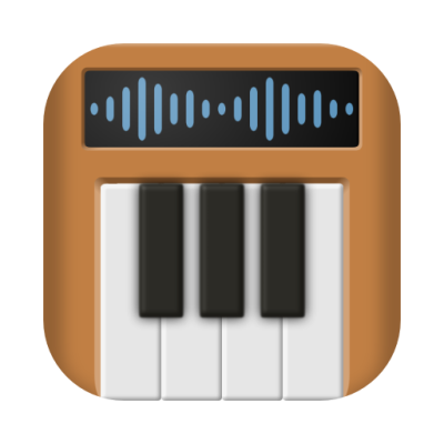
macOS app icon

分类:功能建议
  • Sv 13 0
    消息来自 Sven,发表于
    Hi,

    Every time I start Polyphone on my Mac I see the app icon which is not in line with all the other neat icons in the dock. On top of that -- it looks like a synth is losing its teeth!

    The style is nice but I don't like the loose keys, and that it does not match the form factor of standard macOS icons. So I built on the design and modified it using the official Apple template. I took the original 512x512 icon from GitHub.
    Please consider using this icon for macOS Polyphone (what you do on the other platforms is up to you).

    Cheers,
    Sven
  • 429 1
    消息来自 Davy,发表于 1
    This is indeed a better integration: I will increase the border radius as you did.
    The "teeth" are however an important part of the logo. The idea is to gather and configure sounds for building a complete instrument, division by division and possibly key by key, hence the keyboard keys not attached yet. Polyphone is first an editor, not a synthesizer.

登录或注册后即可参与讨论。

Polyphone 需要您!

Polyphone 是免费的,但其网站和开发都会产生费用。一笔小小的捐赠就能帮上大忙。

捐赠
学习基础知识 试试教程
返回
顶部